 +44 20 3322 7375
 +1 347 391 2804
eBay HTML Editor
Overview
There are two types of eBay Description Editor views in LinnLive: Simple Editor and HTML Editor. To switch from one view to another navigate to Configs -> Configs> EBAY. From the Description editor drop-down box select the desired editor view.
It is recommended to use Simple editor when the HTML code is already prepared. Simple editor passes character to character description to eBay. HTML Template is recommended to be used when creating a template from scratch.
Editing the content of a page element using HTML Editor gives the access to a large number of functions for editing that are similar to those available in word processors such as Microsoft Word. There is also an HTML mode where it is possible to manually edit the HTML code.
Editor Toolbar
In the Edit window toolbar there is a range of editing options. These are described in brief below.
Buttons Description
|
|
Bold - Change the selected text to bold. |
|
|
Italic - Change the selected text to italics. |
|
|
Underline - Change the selected text to underline. |
|
|
Strikethrough- Change the selected text to strikethrough. |
|
|
Align left- Left justify selected paragraph. |
|
|
Align centre- Centre selected paragraph. |
|
|
Align right- Right justify selected paragraph. |
|
|
Align full- Full justify selected paragraph. |
|
|
Styles- Gives you access to a drop-down list of styles predefined in the external CSS files. |
|
|
Paragraph- Gives you access to a list of predefined header and paragraph formats. |
|
|
Font family- Allows you to select available fonts for the selected text. |
|
|
Font size- Allows you to change the size of the selected text. |
|
|
Find and replace- Find and replace selected string of characters in selected element. |
|
|
Cut (same as Ctrl + X)- Use to cut text or image. |
|
|
Copy (same as Ctrl + C)- Use to copy text or an image. |
|
|
Paste (same as Ctrl + V)- Use to paste the text or image that you have copied or cut. |
|
|
Paste as plain text- Same as Paste but any formatting of the text is removed when pasted. |
|
|
Paste from Word - Same as Paste but the formatting of the text is kept when pasted. |
|
|
Undo (same as Ctrl + Z) - Undo last command. |
|
|
Redo (same as Ctrl + Y) - Redo last command. |
|
|
Insert / Edit Image - Use insert to add a new image to your content. Use Edit to edit the properties of the selected image. |
|
|
Insert link - Open dialog box to create link for the selected text. |
|
|
Insert date - Use to insert today's date. |
|
|
Insert time - Use to insert current time. |
|
|
Select text colour - Change the selected text's color. |
|
|
Select background colour - Set the background-color of a part of the text. |
|
|
Insert/Edit Table - Insert a table in selected content or edit the existing table. |
|
|
Table row properties - Specify properties for a selected table row. |
|
|
Table Cell Properties - Specify properties for a selected table cell. |
|
|
Insert Row Before - Insert new table row before selected table row. |
|
|
Insert Row After - Insert new table row after selected table row. |
|
|
Delete Row - Delete selected table row. |
|
|
Insert Column Before - Insert table column before selected table column. |
|
|
Insert Column After - Insert table column after selected table column.t |
|
|
Remove Column - Remove selected table column. |
|
|
Split Merged Table Cells - Split selected table cell(s). |
|
|
Merge Table Cells - Merge selected table cells. |
|
|
Insert Special character - Open dialog box to insert a custom character in content. |
|
|
Insert / Edit Embedded Media - Adds various media files of your choice in content. |
|
|
Insert Horizontal line- Display lines across the screen. |
|
|
Edit HTML source- Switch to HTML editing mode. |
|
|
Insert/Remove Bulleted List- Create a bullet list of the selected text. |
|
|
Insert/Remove Numbered List- Create a numbered list of the selected text. |
|
|
Insert horizontal ruler- Insert a line horizontally across the whole page. |
|
|
Subscript- Change the selected text to subscript. |
|
|
Superscript- Change the selected text to superscript. |
|
|
Decrease Indent- Reduce the indent for the selected paragraph. |
|
|
Increase Indent- Increase the indent for the selected paragraph. |
|
|
Blockquote- Insert white space before and after a blockquote element. It also insert margins for the blockquote element. |
|
|
Properties- Use to insert product tags. Note: In order for the image to display correctly when using Product Image tag, it has to be inserted in HTML Template as a HTML tag. For example: <img src="[{PRODUCT_IMAGE1}]" />. |
|
|
Extended- Use to insert extended properties tags. |
Selecting Styles (CSS)
The Styles option gives you access to a drop-down list of predefined styles specified in the custom CSS file(s). If custom CSS is enabled, you can either highlight the block of text to apply the style to, and click on the down arrow next to Styles, or follow these instructions:
- Place the cursor on the page where you would like the style format to begin, and click on the Styles down arrow;
- Select the style you wish to use from the drop-down list;
- If you highlighted text previously, it will be reformatted according to the style selected. Otherwise, any text you type from that point on will be formatted according to the style selected until a different style or formatting is chosen.
Adding and Editing Images
The Insert/Edit Image button on the toolbar allows to insert an image or edit one inserted previously.
To insert an image into the editing area, follow the steps below:
- Click where you would like the image to appear;
- Click the Insert/Edit Image button from the Editor Toolbar and modify the image using options available in the dialog box.
A dialog box with the following 3 tabs will open: General, Appearance and Advanced. Options each of the tabs contain are described below.
To edit existing images click on the existing image before clicking the Insert/Edit Image button and apply options from the General, Appearance and Advanced tab to the image.
General Tab (Fig. 1.1)
|
1. Add link to the image in the Image URL field or select the image from the Image List drop-down box. The image will appear in the Preview box at the bottom of this tab. Image List contains all images uploaded to our server from the eBay Configurators screen: eBay Configurators ->Settings -> Manage images (Fig. 1.2). Maximum 16 images can be uploaded; 2. Add an image description by typing it into the text field provided (image description appears instead of the image when there is a problem with the image and it fails to display on the webpage); 3. Add a title to the image by typing it into the text field provided (title appears when the mouse is hovered over the image). |
Fig 1.1 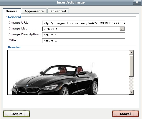 Fig 1.2 Fig 1.2 
|
Once you have selected or entered your image URL, added a title and description, go to Appearance and Advanced tabs of the Insert/Edit Image menu to edit the image.
Appearance Tab (Fig 1.3)
|
1. From the Alignment drop-down box select alignment type for the image. The preview pane on the right (with the image of the tree in it) will illustrate how the various alignment choices affect the way the image lines up with the text; 2. In the Dimensions filed enter the size of the image (in pixels). Enter image sizes in the order of width by height; 3. Tick Constrain Proportions, if you want the image to maintain its aspect ratio (the ratio of width to height) whenever it is being resized; 4. Enter a number in the Vertical Space field to set the number of pixels of white space above the image in the description; 5. Enter a number in the Horizontal Space field to set the number of pixels of white space to the left of the image in the description; 6. Enter a number in the Border field to specify thickness of the border around the image; 7. In the Style field select the class specified in the custom CSS file (if any); 8. Style field automatically displays any style parameters entered above (alignment etc.). |
Fig 1.3 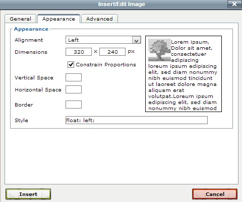
|
Advanced Tab (Fig 1.4)
|
There are two sections in the Advanced tab: Swap Image and Miscellaneous. Swap Image allows to create an interesting effect on your website by displaying multiple images in one location on your page with the cursor action of the site visitor triggering a change from one image to another. Miscellaneous contains some HTML and CSS properties that allow to further define the images and will typically be used by individuals with some design experience. Swap Image 1. To use Swap Image options tick the checkbox against Alternative image first; 2. In the For Mouse Over field enter the URL or select from the Image List the image that will appear when a visitor passes their mouse over the original image; 3. In the Mouse Out field enter the URL or select from the Image List the image that will appear when a visitor passes their mouse off or away from the original image. Note: You may choose to re-select your original image as the For Mouse Out image. Thus, the original image will be displayed when the page loads, the alternative image will be displayed when the mouse passes over the original image and then the original image will return once the mouse is passed off the image area. Miscellaneous These are various HTML and CSS properties that allow to further define the images. If you do not have web design experience, we recommend that you leave these options blank. Once all fields have been filled out, click Insert button. Once you have finished entering the information on all tabs, click Insert button at the bottom left of any tab to return to the editor. |
Fig 1.4 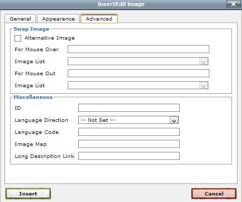
|
Adding and Editing Media Files
The Insert/Edit Embedded Media button allows to add various media files to the pages of your product's description.
- Click where you would like the media file to be placed;
- Click the Insert/Edit Embedded Media button and modify the media file using options available in the dialog box;
General Tab (Fig 2.1)
|
1. From the Type drop-down box select the type of media file to be embedded in the page; 2. In the File/URL field enter the URL for the media. Include the correct prefix (Eg. http://); 3. In the Dimensions field enter the embedded video dimensions (in pixels); 4. Tick the Constrain Proportions check box for the media file to display with a fixed aspect ratio (the ratio of width to height) whenever it is re-sized. |
Fig 2.1 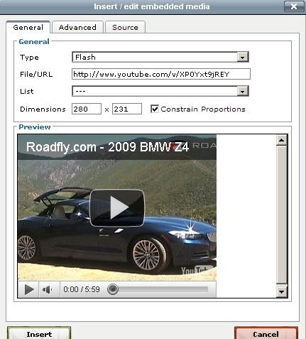
|
Advanced Tab (Fig 2.2)
Advanced Tab consists of two sections.
The top area Advanced allows to set additional options for the media file:
| 1. Enter a number in the Id field to specify the media file Id; 2. Enter a name for the media file in the Name field; 3. From the Align drop-down box select the alignment type for the media file; 4. In the Background field enter the code for the colour to be used as the background for tphe video. If you do not know the code, click the browse icon against the Background field to open the colour palette and choose the colour there; 5. Enter a number in the V-Space field to set the number of pixels of white space above the media file in the description; 6. Enter a number in the H-Space field to set the number of pixels of white space to the left of the media file in the description. |
Fig 2.2 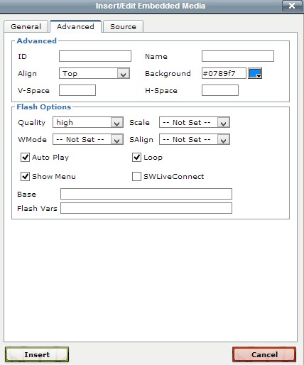
|
The lower area Flash options applies only to Flash files and allows to define a number of additional options for the Flash movies and animations:
|
1. From the Quality drop-down box select the quality options for the Flash file: High: emphasizes image quality over speed of loading and playback; Low: emphasizes speed of loading and playback over image quality; Autohigh: emphasizes playback speed and appearance equally at first but sacrifices appearance for playback speed, if necessary; Autolow: emphasizes speed at first but improves appearance whenever possible; Best: this is the highest image quality setting (and therefore the slowest to load and playback). 2. From the Scale drop-down box select how the application will be placed within the browser window: Showall: makes the entire Flash content visible in the specified area without distortion, while maintaining the original aspect ratio of the application. Borders can appear on two sides of the application; Noborder: scales the Flash content to fill the specified area, without distortion but possibly with some cropping, while maintaining the original aspect ratio of the application; Exactfit: makes the entire Flash content visible in the specified area without trying to preserve the original aspect ratio. Distortion can occur; Noscale: means that no specific scaling option has been selected so the entire Flash content will be visible as defined (w x h). 3. From the WMode drop-down box select whether any flash elements will appear in front of or behind other elements on a page. A good example is html drop-down menus that drop-down over a flash movie. If the WMode is set to transparent, then the drop-down menus will disappear behind the flash. The WMode needs to be set to opaque for the drop-down menus to appear in front of the flash; 4. From the SAlign drop-down box select the alignment type for the area the flash animation plays in with respect to the rest of the page; 5. Tick Auto Play checkbox for the flash file to begin to play automatically when a visitor clicks on it; 6. Tick Loop checkbox for the animation to loop continuously. Leave the checkbox unticked for the file to play once and stop; 7. Tick Show Menu checkbox for the media player control menu to show below the animation; 8. Tick SWLiveConnect for the browser to automatically start Java when loading the flash file into the site. Since starting Java greatly increases the time it takes to start a SWF file (flash animation), tick this box only when necessary. 9. In the Base field enter the version of Flash that your file will use by entering it into this text field (normally left blank); 10. Use the Flash Vars to pass variables into a flash movie at the root level. If the flash file has been programmed to act on the specified variables- it will, otherwise the variable will not affect the flash file (normally left blank); 11. Click Insert button to confirm changes. |
|
|
Source Tab (Fig 2.3) Use this section to paste the code for the video or edit the inserted video settings from here. This is where you insert <object> tag to embed multimedia and <param> tags to pass parameters to plugins that have been embedded with the <object> tag. |
Fig 2.3 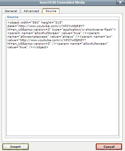
|
Using JavaScripts
It is possible to insert JavaScripts in the editor. However, it is recommended to insert Java Script in Simple Editor. Before doing so, make sure that all comments are removed e.g.
For example, this script will not work:
<script>
function()
{
var bla=1; <!--any comment-->
}
</script>
But this one will:
<script>
function()
{
var bla=1;
}
</script>
Expressions - How to
It is recommended to insert expressions in Simple Editor.
How to create image thumbnail view?
In product description screen insert expression snippet – Internal Image selector.
<div>
<img id="im" width="400" height="400" src="[{PRODUCT_IMAGE1}]" border="0">
</div>
<div>
({IF["[{PRODUCT_THUMBIMAGE1}]"!=""]})
<a onclick="document.getElementById('im').src='[{PRODUCT_IMAGE1}]'"><img src="[{PRODUCT_THUMBIMAGE1}]"/></a>
({ENDIF})
({IF["[{PRODUCT_THUMBIMAGE2}]"!=""]})
<a onclick="document.getElementById('im').src='[{PRODUCT_IMAGE2}]'"><img src="[{PRODUCT_THUMBIMAGE2}]"/></a>
({ENDIF})
({IF["[{PRODUCT_THUMBIMAGE3}]"!=""]})
<a onclick="document.getElementById('im').src='[{PRODUCT_IMAGE3}]'"><img src="[{PRODUCT_THUMBIMAGE3}]"/></a>
({ENDIF})
</div>
({ENDIF})
How to insert RRP price crossed over and the actual price of the product displayed next to it?
Import RRP price as an attribute. And use to following expression snippet.
Our Price ({=N2[[{PRODUCT_RRP}]]})</br>

How to output a list of product features as a list?
Import product features as attributes (Product Feature 1, Product Feature 2, Product Feature 3 etc). Use the following snippet to output HTML list
({IF["[{Product Feature 1}]"!=""]})
<li>
[{Product Feature 1}]
</li>
({ENDIF})
({IF["[{Product Feature 2}]"!=""]})
<li>
[{Product Feature 2}]
</li>
({ENDIF})
({IF["[{Product Feature 3}]"!=""]})
<li>
[{Product Feature 3}]
</li>
({ENDIF})
</ul>
Videos
|
|